
Trong thiết kế web hiện đại, việc hiển thị dữ liệu dưới dạng bảng (table) là một yêu cầu không thể thiếu. Tuy nhiên, khi nói đến việc tối ưu hóa bảng dữ liệu cho các thiết bị di động, đó lại là một thử thách không hề nhỏ. Với kích thước màn hình hạn chế của các thiết bị di động, việc hiển thị toàn bộ dữ liệu mà không làm mất tính trực quan và dễ dàng tiếp cận trở thành một vấn đề đáng quan tâm.
Trong bài viết này, chúng ta sẽ cùng tìm hiểu cách tạo bảng responsive – một giải pháp giúp bảng dữ liệu hiển thị tốt trên mọi loại màn hình, từ PC đến điện thoại di động, chỉ với HTML và CSS.
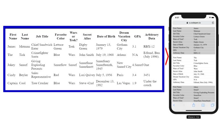
Vấn đề với bảng dữ liệu trên di động:
Một bảng với nhiều cột khi hiển thị trên màn hình máy tính sẽ không gặp phải vấn đề gì. Tuy nhiên, khi thu nhỏ màn hình xuống kích thước của một thiết bị di động, bảng sẽ trở nên khó đọc. Nội dung của bảng có thể bị cắt bớt hoặc bắt buộc người dùng phải cuộn ngang để xem hết dữ liệu. Việc này không hề thân thiện với trải nghiệm người dùng (UX), vì người dùng thường quen với việc cuộn dọc hơn là cuộn ngang trên các thiết bị di động.
Giải pháp sử dụng CSS thuần:
Đây là đoạn HTML mẫu:
<table role="table">
<thead role="rowgroup">
<tr role="row">
<th role="columnheader">First Name</th>
<th role="columnheader">Last Name</th>
<th role="columnheader">Job Title</th>
<th role="columnheader">Favorite Color</th>
<th role="columnheader">Wars or Trek?</th>
<th role="columnheader">Secret Alias</th>
<th role="columnheader">Date of Birth</th>
<th role="columnheader">Dream Vacation City</th>
<th role="columnheader">GPA</th>
<th role="columnheader">Arbitrary Data</th>
</tr>
</thead>
<tbody role="rowgroup">
<tr role="row">
<td role="cell">James</td>
<td role="cell">Matman</td>
<td role="cell">Chief Sandwich Eater</td>
<td role="cell">Lettuce Green</td>
<td role="cell">Trek</td>
<td role="cell">Digby Green</td>
<td role="cell">January 13, 1979</td>
<td role="cell">Gotham City</td>
<td role="cell">3.1</td>
<td role="cell">RBX-12</td>
</tr>
<tr role="row">
<td role="cell">The</td>
<td role="cell">Tick</td>
<td role="cell">Crimefighter Sorta</td>
<td role="cell">Blue</td>
<td role="cell">Wars</td>
<td role="cell">John Smith</td>
<td role="cell">July 19, 1968</td>
<td role="cell">Athens</td>
<td role="cell">N/A</td>
<td role="cell">Edlund, Ben (July 1996).</td>
</tr>
<tr role="row">
<td role="cell">Jokey</td>
<td role="cell">Smurf</td>
<td role="cell">Giving Exploding Presents</td>
<td role="cell">Smurflow</td>
<td role="cell">Smurf</td>
<td role="cell">Smurflane Smurfmutt</td>
<td role="cell">Smurfuary Smurfteenth, 1945</td>
<td role="cell">New Smurf City</td>
<td role="cell">4.Smurf</td>
<td role="cell">One</td>
</tr>
<tr role="row">
<td role="cell">Cindy</td>
<td role="cell">Beyler</td>
<td role="cell">Sales Representative</td>
<td role="cell">Red</td>
<td role="cell">Wars</td>
<td role="cell">Lori Quivey</td>
<td role="cell">July 5, 1956</td>
<td role="cell">Paris</td>
<td role="cell">3.4</td>
<td role="cell">3451</td>
</tr>
<tr role="row">
<td role="cell">Captain</td>
<td role="cell">Cool</td>
<td role="cell">Tree Crusher</td>
<td role="cell">Blue</td>
<td role="cell">Wars</td>
<td role="cell">Steve 42nd</td>
<td role="cell">December 13, 1982</td>
<td role="cell">Las Vegas</td>
<td role="cell">1.9</td>
<td role="cell">Under the couch</td>
</tr>
</tbody>
</table>
Chúng ta có thể biến bảng dữ liệu trở nên responsive bằng cách sử dụng CSS3. Dưới đây:
@media
only screen and (max-width: 760px),
(min-device-width: 768px) and (max-device-width: 1024px) {

/* Chuyển đổi bảng từ dạng bảng sang dạng block */
table, thead, tbody, th, td, tr {
display: block;
}

/* Ẩn tiêu đề bảng (nhưng không sử dụng display: none để vẫn duy trì khả năng truy cập) */
thead tr {
position: absolute;
top: -9999px;
left: -9999px;
}

tr { border: 1px solid #ccc; }

td {
/* Biến mỗi ô thành một hàng */
border: none;
border-bottom: 1px solid #eee;
position: relative;
padding-left: 50%;
}

td:before {
/* Hiển thị nhãn của dữ liệu */
position: absolute;
top: 6px;
left: 6px;
width: 45%;
padding-right: 10px;
white-space: nowrap;
}

/* Nhãn cho từng ô dữ liệu */
td:nth-of-type(1):before { content: "First Name"; }
td:nth-of-type(2):before { content: "Last Name"; }
td:nth-of-type(3):before { content: "Job Title"; }
td:nth-of-type(4):before { content: "Favorite Color"; }
td:nth-of-type(5):before { content: "Wars or Trek?"; }
td:nth-of-type(6):before { content: "Secret Alias"; }
td:nth-of-type(7):before { content: "Date of Birth"; }
td:nth-of-type(8):before { content: "Dream Vacation City"; }
td:nth-of-type(9):before { content: "GPA"; }
td:nth-of-type(10):before { content: "Arbitrary Data"; }
}
Giải thích cách hoạt động:
CSS trên sẽ biến đổi mỗi hàng trong bảng thành các block riêng lẻ khi màn hình co lại dưới kích thước 760px (hoặc trong các trường hợp khác đã được định nghĩa). Mỗi ô trong bảng sẽ được hiển thị như một hàng, với nhãn tương ứng ở phía trước giúp người dùng dễ dàng nhận biết thông tin.


 ZALO
ZALO